While participating in the biggest local game jam last weekend (SPJAM) with many amazing and awesome people, I took the opportunity to do a few playtest sessions of the first level implemented with the game developers around.
For you to have an idea of how important are the outlines of the environment and how much they can influence (for good or bad) your perception during puzzle solving, here's a small iteration I did after quietly observing (one of the hardest and most important things to do, seriously) the playtesters:
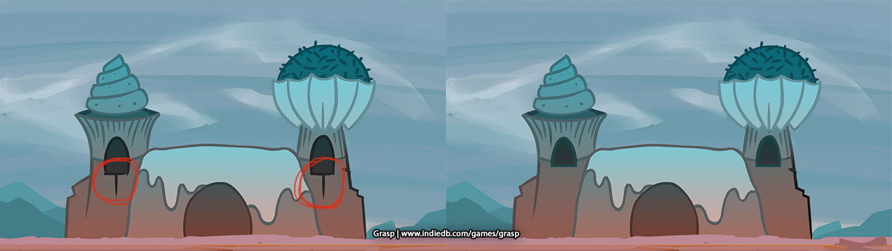
The details highlighted by the red circles were inducing the playtesters to think they were placing an object on the correct position, when in the end, that was incorrect. Yeah, smooth! Perception is key (but balanced details and great puzzle design are obviously necessary, so that's why I'm fixing that lol). I might have also made some silhouette darker. Can you see it...?
After the playtests and feedback collected, I took another look into the colours to try and achieve a more pleasant and interesting atmosphere:
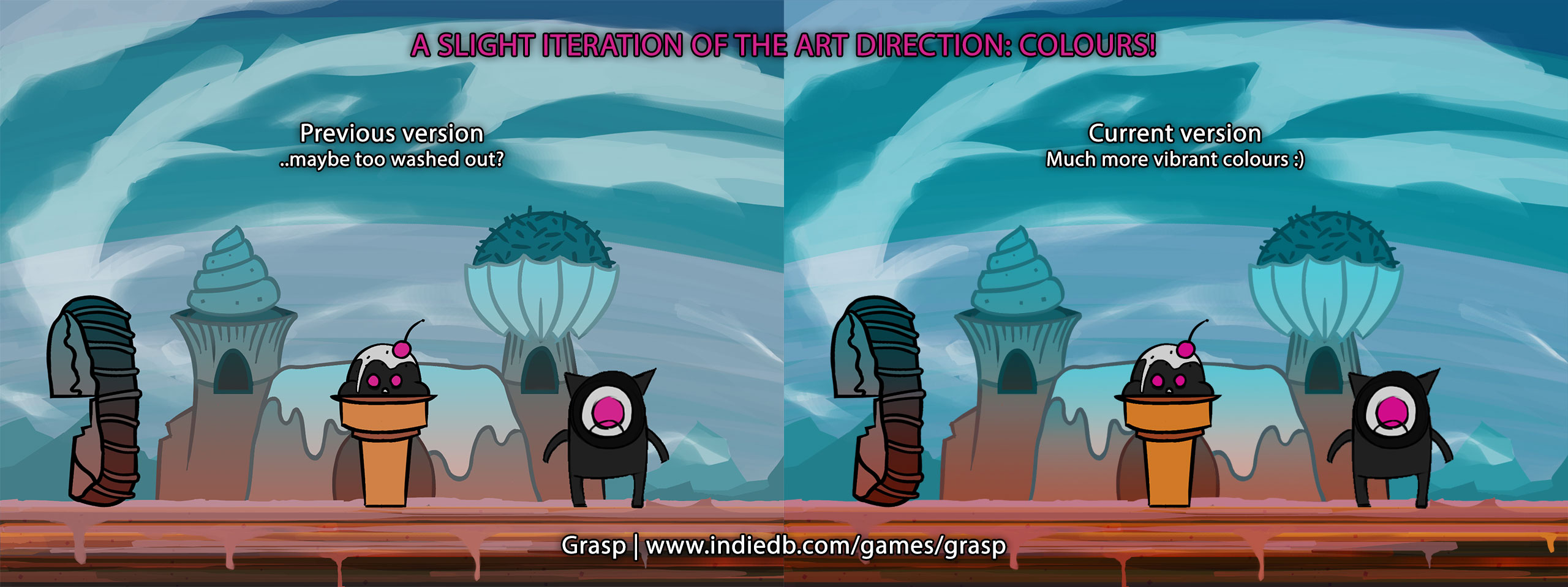
I made the game a lot more vibrant! I aim to achieve a more fun and interesting look.
What do you think? What version do you like the most? ...and why? Is it excessively vibrant? Is it deliciously vibrant? Is the cake a lie?
(New levels are currently in development, by the way)
Thank you!
Anselmo