Hello again or for the first time,
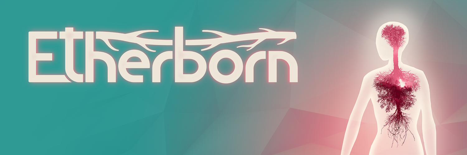
If you’ve been following us for some time, you probably would’ve noticed that there is something a bit different about us (and if it’s your first time – nice to meet you and don’t worry, hopefully, this article will be interesting for you as well). For the last few weeks, our Creative Director Samuel has been thinking about changing the look of our logo. And finally, after weeks of self-torture and dozens of reiterations, he showed us the new Etherborn logo. Here it is, below in all its glory:
Ta-daa!
Now, as with everything in life I guess, there is a thought put behind the logo. A good logo should somehow tell you about the game, either consciously or subconsciously (ever looked at the Amazon one? The smile is an arrow that goes from A to Z. Sneaky bastards…). So let me explain what our logo’s design process was like.
![]()
![]()
![]()
![]()
Initial sketches
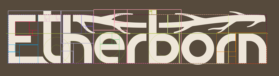
First up, the typography, aka, the font. If you look at Etherborn’s gifs/videos, you might notice that our level design is based on square angles and quarter of circumferences. That design is what inspired our logo’s font. Also, the curved walls in Etherborn are the ones that “shift” the player’s gravity, so the font pays homage to that mechanic as well.
The next major “feature” of the new logo is the tree branch. You might’ve noticed in our gifs and trailers that there is a tree in our game. Without revealing too much, the tree will play a significant role in the story. Bonus clue - If you look at our character’s artwork that’s just to the right of the logo, you might get an even bigger idea about what to expect. Or it might completely confuse you. Either way – enjoy 😊
Lastly, we wanted the logo to convey the ideas of stillness, simplicity, harmony – the ideas that are present in the game itself. And of course, all of the elements we created (the font and the tree) have to be in proportion. To start off, Samuel used the golden ration and calculating dynamic rectangles – that was his starting point. However, if you take a look, you might notice some “inaccuracies”. Sometimes, you need to adjust things and make them off-balance on purpose to make it look more “correct for the eye”.
That’s it from us for this week. We hope that you like the new logo that we created. Let us know how you feel about it in the comments, or on our social channels. We love any new people that come on board, so if you haven’t done so already, follow us on Facebook or Twitter.
Until next time,
Michal/AMT (Altered Matter Team)