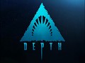
We have been working feverishly over the last week to develop a website for our game. We would have liked to have one sooner, but work on the game itself was using up 100% of our time! Well, we finally took some time out to develop a nice little space on the web! We hope you like the results. Remember to stop by our forums and post what you think of the game so far!You may also have noticed that we've got a new logo. We felt that the old one was getting a little long in the tooth (hurrrrrr) So we designed one from the ground up based on the concept of the original logo - but using a simplified design that we think better reflects the game's vibe. What do you guys think? Is it an improvement?

Last, but definitely not least : We would like to give you all a sneak peek of the Tiger shark. Known as the "wastebasket of the sea", Tiger sharks will eat almost anything. Young tigers sport a jumble of spots and stripes along the length of their body giving them their namesake. >In Depth, the Tiger shark class is the "happy medium" between the bulky Great white, and the agile but fragile Mako. His bites dish out a considerable amount of punishment, but he is also fairly maneuverable. Like all sharks, he is capable of regenerating health. Unlike his companions, the Tiger is able to sniff out enemy divers at a considerable distance - making him an excellent "detector" class.

Thats it for now folks! As ever, watch where you swim!
Love,
The Depth Team
Don't forget to check us out here too:
![]()
![]()
![]()
![]()


that's freakin scary D;
I actually really like both logos. Either one would do just fine.
Your gonna do what jaws did to beaches, but to scuba divers.
pretty sweet!!
i just showed this to my mate he said holy *%!$ i want this *&^$%^*(
that game will be epic ^&*(%$£ , i think it likes it :)
I like the old logo more than the new one. And good ideas for the tiger shark.
Nice redesign.
The new one, definitely, although I don't like that white borders around it
and a bit better antialiasing wouldn't hurt either
I think it would be cool if Human players spawn and start on a boat where they select their special class based equipment before jumping down intot he depths below. Should have some giant coral reef levels with underwater cave mazes, like complexes and sunking ships to navigate through.
I think the most complexity of this game will be balancing of the classes and factions, since sharks of course will only be biting you and maybe raming you full speed to knock you back, while the divers have knifes and other weapons.
Since sharks are so fast, I'm assuming the divers have to mostly stealth since I can't imaging them putting up a fight against the jaws of a shark? In any case best of lukc it looks very interesting.
i prefer the oldo ne tbh
I think I prefer the older logo, seemed much more relevant to the style of the game and the visual style of your moddb profile.
O love the new logo, imo you should stick with it...
Have to agree that I like the old logo much better since the new one doesn't seem to reflect the style of the few images you have posted so far. However its just a logo and isn't that big a deal ;)
Can't wait to see how the balancing goes with the different classes and species. Either way this will be very different from most games and I look forward to further increasing my fear of deep dark waters and sharks :)
The old logo was badass, it reminded me of Jaws. The new logo reminds me of primitive cave drawings which doesn't really fit the game.
or *does* it ? :)
wow sweet
I too like them both, but I admit to preferring the older one more as to representing the true theme and game play consequences of the mod. The new one, on the other hand, looks much sleeker.
Congrats on the new site and superbly played tease with that awesome " Tiger " !
Hmmmm, definately liked the old logo over the new one aswell, but they're both good in their own way; The old logo has lots of colour, where as the new one is just black. I couldn't imagine that coloured tooth with the black logo, nor could I imagine the black tooth symbol with the old one.
However, again, if I were to choose from the two, i'd choose the first...I think the colour and effort put into the logo makes i stand out much more.
Either way, they will be fine though :)
And holy bubbles, if I see that shark coming at me, i'm going to flip out! YIKES! really well done shark models here guys, and it's great to see the amount of progression made in short time....i'm sure there is much more to it behind the scenes, but so far it's look fantastic, keep it up :)
In the mean time, I shall be playing "Diver 3D - Deep water adventures", it's the only diving game that I know to this date which is actually semi decent.
thanks Otreum.
Have you tried Shark! (Hunting the Great White) ? It's an old but very very atmospheric single player game. Scary stuff.