I'm 2 days into the kickstarter/greenlight campaign now, and I'll take a break from promotion to write a proper dev blog post!
I've been getting a lot of questions about the graphics in Concrete Jungle, so I thought I'd go into detail about my process behind making them from concept through to completion.
It starts off with my great big list of buildings and a loose idea of what effects it could have.
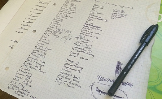
This list is super important so I keep it in poor condition with coffee stains on it to make sure nobody steals it. That's worked so far.
I have a certain amount of cards planned out- but I quickly learnt planning every single building's effects out in complete detail was pointless, as until they are put in-game it's impossible to figure out balancing and how well they work. I think I've changed the effects of the Landfill site about 4 times in the last few weeks for instance.
But although the individual building mechanics may change, the graphics probably won't change a lot, so the main process at the moment is just getting those buildings from my list into the game in a presentable manor so I can balance the effects as the game progresses.
The buildings in the game are a hybrid of 3D rendering and a lot of colouring in Photoshop. I need to get an idea of what I want the building to look like in my head, so to begin with I just look around the internet for pictures of a relevant building for inspiration. This has lead to perhaps one of the dullest google search histories imaginable.
Once I've got a general feel for what I want, it's time to get modelling! When I first started the project, I began by building a collection of simple models I could use as building blocks. Some box-shaped buildings- a shed, a bay window, a chimney, a smoke stack- you get the idea.
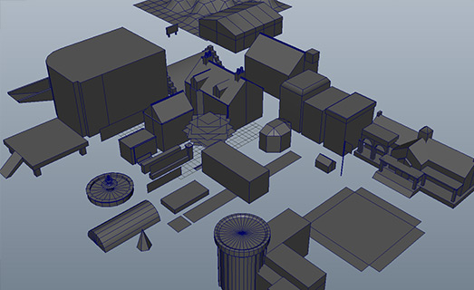
Every time I make a new model that could be used elsewhere, it gets added to this library. Due to the sheer number of 3D models needed to create a visually interesting city, I've also used a few stock models from turbosquid along the way. I try and model as much as I can myself though, about 85% of the models used are my own.
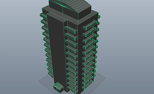
Most buildings feature a unique model for the main 'building' part.
UV mapping is a time consuming process, but oddly pleasing- it's like a puzzle game in itself. Texturing is fun. It usually involves a lot of visits to cgtextures.com, possibly the greatest texturing resource known to man. I do a lot of photo editing on the texture though, it's rarely exactly what I'm looking for.
Once I've got the models ready, I arrange them on a template scene I have set up which includes the lighting and the base ground tile (neither of these things I want to vary from building to building). I usually leave making the ground texture until last.
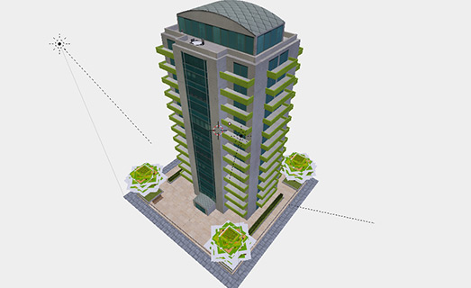
Once everything is arranged pleasingly, it's time to render. I'm using Blender to generate my renders- it's completely free and it's rendering engine is delicious. The scene I'm using has the render camera set up to render isometrically (is that a word?) What's outputted is something that looks like this but bigger:
It looks ok, but it's not as vibrant or colourful as I would like. A CGI pro would be able to make it look like what I end up with inside Blender- but firstly my skillset isn't there yet, and secondly I quite like the semi-painted look. It gives it a certain degree in imperfection which I like. So it's off to Photoshop for the rest!
When I began the project I spent a long time experimenting with different colouring. I settled on something that looks vibrant and saturated but not garish or too cartoony. The secret is to swap out the blacks and greys in the image for deep blues, purples and oranges. This keeps things colourful, even when I'm modelling something like a chemical plant, which is perhaps about as dull a building as you can get.
My methodology inside Photoshop involves experimenting a lot with different blending styles. Because I needed some consistency with the buildings in the game, most decisions were made at the start of the project and put into a template. So I load my rendered image into my template Photoshop file and get painting.
This is my template/process, which probably won't make too much sense unless you're familiar with photoshop-
-The first layer is the rendered image from Blender (above).
-Then I have a group consisting of decals I've made in Photoshop. Basically details that I've chosen to paint from scratch and not rendered in 3D. The biggest example would be the trees- they just look better painted. Like the 3D models, I build a library of re-usable decals.
-The first thing is to get rid of that dull grey shadow on the isometric right side, so I paint a layer of purple over the shadowed area and set the blending mode to 'soft light'. I've got some custom isometric plane brushes I can use so the painting doesn't clash with the isometric viewpoint.
-Next is to make the opposite highlighted side warmer, so I use a dark yellow to paint over highlights and set that to linear dodge/add.
-After that I've got an additional layer set to linear/dodge add, where I just add miscellaneous highlights the building may need.
-Finally I've got a layer to really add some omph to the shadows. It's a layer where I paint a burnt red onto shadows and burnt orange onto highlights and it's set to colour dodge with 50% opacity. It gives it an extra warmth.
That's all the painted layers, but after that I also have a play around with some colour correction, so I've got a collection of adjustment layers set up on top:
Hue/Saturation- bringing out the reds a little more
vibrance- upping the saturation just a touch
a deep purple -> cream gradient map set to soft light on 75% opacity to up the contrast in a colourful way.
A selective colour config which brings out more red in the shadows (this may not make sense when combined with the above as I just made the shadows more blue and now more red again! I like what I ended up with though so it stayed. If this were code, it would be woe-fully inefficient code, but it's not it's Photoshop- doesn't really matter!)
The last thing is something any Photoshop user will balk at- it's a filter. Filters are the things everybody tries when they first learn photoshop- they load up an image, apply an artistic filter and then think to themselves 'holy crap, I might just be some kind of genius!' It's then uploaded to the internet's collection of identically processed images in some unvisited corner of deviant art.
So while filters are something to avoid generally, I think they do have a use if you use them very subtlety. In this instance I use ink outlines filter to sharpen up the edges. It also increases the brightness somewhat depending on it's settings -something that can be achieved through level adjustment anyway- but it's the edge sharpening effect that I'm interested in here. The brush strokes setting is dialed right down, as is the dark intensity. There are 2 elements to the subtle use- 1) the original image is much bigger (4x) than the final image used in game, so any bold effects are reduced with scaling it down. 2) I use this on a final layer which is copy-merged from everything below and put on 50-75% opacity. In the large image the effect is noticeable and looks a bit off, but when scaled to the in-game size it looks decent- nice and sharp! I would probably avoid this effect if not down-scaling though.
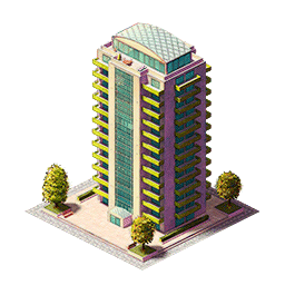
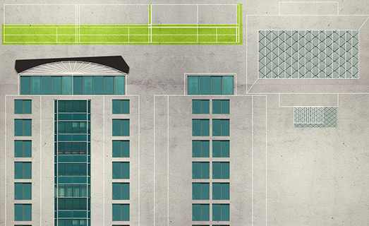
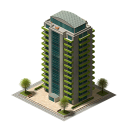
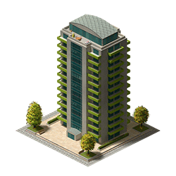
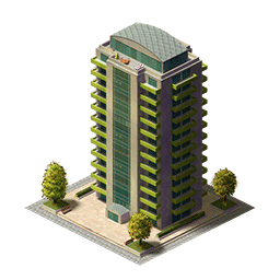
There we go - the final building.
That concludes the first in-depth dev log. There are currently 44 buildings in the preview build, but I have 150 total planned for the final game.
Back to promotion mode- Concrete Jungle is on Kickstarter & Greenlight right now! Check it out!


this looks pretty cool, graphics wise anyway, the way your coming at it looks refreshing when looking at games like sim city, good luck, clicked the follow button :)