Most of the post-7DRL weeks of development were spent improving usability rather than tweaking the gameplay itself (which was already pretty solid). Usability, as well as availability and presentation of information, are vital to ensuring the best user experience after all (duh).
There is still plenty of room for improvement, though, and much of it is made possible by this first update:
Non-square Fonts
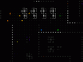
Text composed of square fonts is a pain to read. See a comparison between a parts list from the 7DRL, and the new list after switching to a narrower font:

A later unreleased version of the 7DRL prototype did implement narrow monowidth fonts like this, but the interface wasn't going to take full advantage of the altered layout, so it was scrapped.
The new font dimensions will apply to all areas of readable text, the only exception being the map, which will continue to use square cells.
It's not just more readable, it also gives us 50% more horizontal space to work with! Look at all that empty area off to the right just waiting to display more useful information. Condensed text will allow the entire HUD to become a lot more informative than it already is.
Layout
Let's look at that working mockup again and examine each component:

MOCKUP
The message log, seen top left, used to span the entire top side of the map, but once cut in half there is room for another multi-function window next to it. In the mockup it's showing combat calculation details which when activated used to be interspersed in the log itself and could clutter it up. That same window will be able change modes depending on what you want available; other options will probably include a more detailed status summary, information about nearby friendlies, or an extended log.
The top-right corner is more or less unchanged, still showing basic stats.
Below that the scan window was halved, enabling the volley window to be moved up next to it.
Then the parts list was shifted up, but not narrowed because the right side will be perfect for showing extra information about parts. Aside from new status labels that may appear next to certain items, the rest of the reclaimed space will show optional additional information depending on user-chosen settings. The mockup currently shows an approximation of relative coverage for each part, an important but less obvious stat from the 7DRL which lends itself great to visualization. Other options would be integrity visualizations and numeric stat summaries.
By shifting up the parts list four lines, the original six-slot inventory view is expanded to ten slots. This is great for browsing larger inventories, and fits perfectly into the command scheme since keyboard players access the inventory via number keys, of which there are ten, not six. Also, like the parts list there is now room for extra information.
Style
The overall style will not change, since the high-tech interface already fits the theme. Window titles do have a new look, along with some other tweaks to make the interface more stylish and readable.
Animated effects will be implemented across the GUI to reflect Cogmind's state, adding visual reinforcement for conditions like taking damage, system corruption, and overheating. This both contributes to the immersion and provides useful feedback.
The ubiquitous printing sound for text animations will be a lot softer and more background-ish,and plenty of new sounds will be introduced for more specific uses.
Content
The interface can easily seem overwhelming at first. Naturally some will hate the detail, others will enjoy it. For those on the fence, and to help new players figure things out quickly, there will be an optional tutorial as well as context-sensitive help pop-ups to explain things. These will even go so far as to explain essential game mechanics where appropriate.
I still don't like the idea of the player having to take their eyes off the map to get more detailed combat-related feedback, so there still needs to be more of this information shown directly over the map itself near the action. Something along the lines of an option to float numbers over damaged units would be a minimum way to alleviate this issue.

Like the UI wasn't already good enough ;)
Seriously though, this project is transforming into a masterpiece.
Thanks--roguelikes are already among the most mechanically deep games out there, more of them with advanced UI is what we really need! Too bad masterpieces sure take an epic amount of time :/
Mmh, very interesting article, love the part about the fonts ^^. Thanks :)
Glad you enjoyed it! Not many roguelikes take fonts into consideration as part of the design, but for me it's integral to creating the right kind of experience.