I’m Dani Garcia, Game Designer and Artist at Lunatic Pixels, currently working on our first game, Alchemic Jousts, and I want to share some Photoshop-like tricks we implemented and used to improve the game visuals.
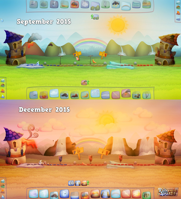
Same image before and after the process.
While working on the game, and once we started sharing images of it, we realized we had an important problem. Any screenshot we took of the game looked the same, specially when placed in a gallery with several thumbnails of them. The reason for that is that the game takes place on a static background with a static camera, and the variety comes from the skills players are using, the game mode, etc., things that can’t be seen on a thumbnail.
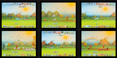
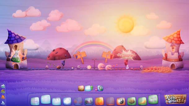
This is how our gallery looked like, everything seems identical.
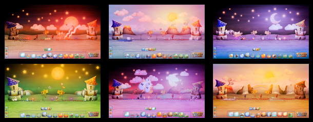
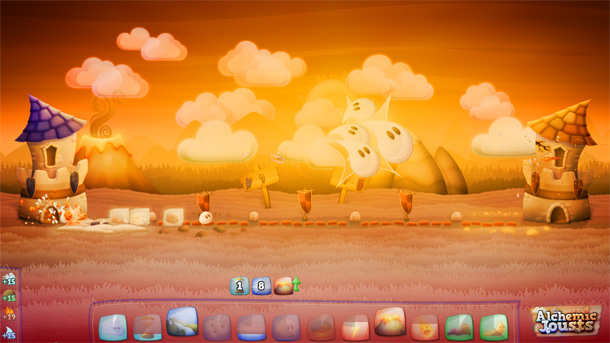
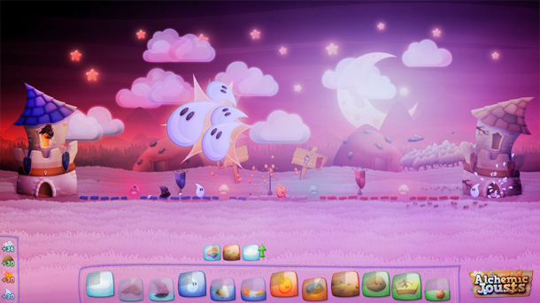
This is how our gallery looks now, with much more variation.
We needed to add some variety to the scene to make it more appealing for the players, but creating several scenarios wasn’t a good option for us. We are only 2 people doing the game, and there are so many things to do, we decided we couldn’t spend a large amount of time creating a huge amount of new graphics. Instead, we implemented and used some tricks, things you can do in a software like Photoshop, which allowed us to achieve much more variety while spending much less time. And the best of it is that some of those effects can be used for many other purposes, so now they are tools we have ready to use any time we want.
A few new graphics
The idea on all this process was to spend the least amount of time creating new graphics, but there were a few of them we couldn’t avoid to create, so let me quickly talk about them.
We already had a Sun graphic, but it was a bit flat, so I tweaked it a bit. I was also able to reuse already done graphics to create 2 Moons (one full and one not), a Star, a few Mushrooms and 3 different Clouds, so all those were done very quickly.
The part I had to spend more time in all this process was redoing the “Buffs” (which are the Mountains, Volcanos, Waterfalls,… you can see in the background). In Alchemic Jousts, “Buffs” are permanent improvements the players can cast on Zones they control, so they change from game to game depending on each player’s Skill selection. This means they are the most important gameplay element in terms of visual impact, so they are a substantial part in this process.
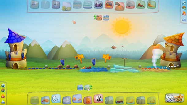
Mountains and a Volcano in this example. They looked too simple.
In this case, the first version of them was too simple, so I decided it was worth redoing them from scratch. As we wanted to increase visual variety, I created 3 versions of most of them, which are randomly selected every time they are cast. And even if the same version of a “Buff” is placed twice, we have a system that deforms them in the same way the terrain below is deformed, which makes them look a bit different.
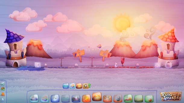
New Volcanos looking much better.
At this point, with these new graphics done, I was able to start creating the new scenarios.
Changing the Sky
In Alchemic Jousts, the sky takes more than 50% of the screen space, so it’s the part that has a bigger visual impact, and it needed to be improved.
The sky color we had was created with a very simple blue gradient, only 1px wide and around 100px tall. I started by creating 14 other different gradients like that one, using as much variation as possible, so we ended having blues, purples, yellows, reds or even greens. For each one of those sky gradients I created a “scenario” file, containing:
- 3 different Sun or Moon position, rotation and scale which where manually placed.
- Around 20 Clouds and/or Stars, which were also manually placed changing their position, rotation and scale.
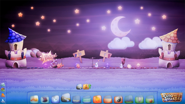
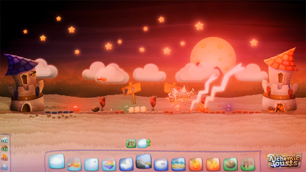
We finally had night scenes now.
With that done, our programmer randomized them, so every time a new game is created, a random scenario with its sky will be selected, one of those 3 random positions of the Sun/Moon will be chosen, and a certain random amount of those clouds and stars will be visible (the other ones will be simply made invisible).
HSL
Now we start with the Photoshop tricks. If you know Photoshop or any other similar software, you might be familiar with the HSL modifiers (or Hue, Saturation and Lightness). They allow you to change any given color (or image) to any other color you want, by changing its Hue (changing the color as we would usually describe it), its Saturation (making that color more vibrant or washing it out) and its Lightness (moving the color closer to white or closer to black). It doesn’t overwrite the colors, it just displaces them in one or other direction.
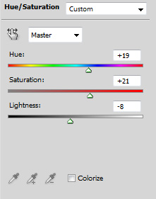
HSL panel in Photoshop.
We implemented an HSL effect in our engine, and started using it on… basically, everything. The most important part is the grass, as it also takes a huge amount of screen space. We only have 1 “grass color” texture, which is the original green we had on our first screens, but every time a scenario is generated, randomized values of the HSL will be applied on it, generating any possible color (we did the same as with the sky, and went crazy with the possible colors the grass could have, even if they didn’t make sense in the real world).
Purple grass. Because, why not?
But we also applied the HSL on almost everything else using smaller ranges. The sky gradient, the clouds, the stars… even those “Buffs” cast by the players, every time they are created they get a randomized HSL modification, so they don’t look exactly the same. It’s a small effect if you only apply it on one object, but all together makes a big impact.
Gradient Tint
The amount of randomization we had at this point seemed good enough, so it was time to start simulating different lighting conditions. We had several skies with very different colors, but the foreground wasn’t reacting to that. We could have a night sky, but everything else looked like it was noon, which made no sense, and also reduced the amount of variation we had.
The solution was very simple. We created new gradients with the colors of each of the sky gradients we had (very simple ones, 1px wide only), but in this case we also added an alpha channel on them. They were applied on top of everything on the screen, each one matching its sky, and the alpha channel made its opacity around 15-30% on the grass zone, and fading to 0% opacity when roughly reaching the sky. This way, a tint with the colors of the sky was applied on top of all the ground elements, including the Elementals and Spells cast, which made it look as if the light from the sky was really affecting the ground.
Everything on the scene gets some of the yellow/red colors of the sky.
Glow, Overlay…
At this point the sky seemed to be lighting the scene, but the Sun/Moon was just a graphic in the scenario, not casting any kind of light. Also, all the gradients used so far were 1px wide, which means there was no horizontal variation in any part of the screen, left and right looked the same.
There’s always a Sun or Moon on the scene, so that had to be the element breaking that horizontal symmetry. We used two effects to do it.
First, I created a few (5 or 6) radial gradients with different colors, with an alpha channel strong at the center and also fading radially on the edges, and automatically centered them in the same position as the Sun/Moon was on every scene, with a large scale covering a big part of the screen, to simulate a Glow effect. That’s basically the same Tint effect we did with the sky, but this time we used a different color on each scenario to contrast the sky color, and as the Sun/Moon are never placed exactly on the center of the screen, we got an uneven lighting on each side of the screen, which makes the result more interesting.
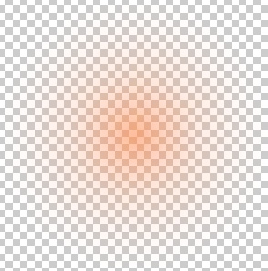
Something really simple, like this one.
But that’s just a tint, and we wanted to have some contrast between the zones close to the Sun/Moon and the zones far from it. The ‘Overlay’ blending mode is excellent for that. In case you don’t know it, this is how the ‘Overlay’ mode works in Photoshop:
With your image layer below, create a black and white layer in ‘Overlay’ mode over it. If you paint that layer with 50% grey (128,128,128), the layer below will be unchanged. Anything you paint lighter than that 50% grey, will make the image below brighter, and anything you paint darker than that 50% grey will make the image below darker.
With that in mind, I created another radial gradient, going from white on the center to black on the edges, without any alpha, and also placed it centered on the Sun/Moon, with the ‘Overlay’ blend mode implemented. This way, the zones close to the Sun/Moon where looking brighter, and the more far away from it the darker it became, giving the impression the scene was really being lit from that point, and also adding contrast to the scene, which is also very important (but more on that later).
There’s much more light around the Moon than on the left side.
…and Multiply
Another useful blending mode in Photoshop is ‘Multiply’. In this case, having a black and white layer with the ‘Multiply’ mode will cause the dark zones to darken the image below, while the white parts remain unchanged. It’s commonly used in any kind of image retouching/artwork to create a ‘Vignette’ effect, which basically makes the edges of the image a bit darker, specially on the corners, creating a subtle frame for the image.

Vignette Texture used ingame.
And that’s exactly what we did inside the game. We created a ‘Vignette’ texture, basically a huge white blurred circle over a black background, and applied it on top of the final rendered image with that ‘Multiply’ mode, creating that subtle frame for all the scene, and also adding some more contrast to the final result.
Firewatch-like scenario.
Contrast and Saturation
There’s a couple more effects commonly used in digital retouch we did to improve the final result. With all the gradients we added, specially the Tint effects of the sky and the Sun/Moon, the colors were a bit washed out, and the result was not as vibrant as it was previous to all this process. We wanted to get some of that back.
First, we used the HSL again to increase the saturation of the whole scene a bit. It will depend on your game and the kind of mood you want to create, but adding an HSL to the end of the render process can help a lot creating that mood. For our game, it made sense to just increase the saturation, but we could have also played with the hue and lightness components of the effect to create any kind of mood.
Increasing saturation made this sky look red instead of pale pink.
Finally, we also wanted to increase the contrast of the scene. Contrast is the amount of difference between the dark and the light parts of your image, and usually we find contrasted images to be more attractive to the eye. Photoshop has a ‘Curves’ modifier, that lets you play with the shape of a curve to modify the amount of lightness each pixel has. Instead of modifying the image as a whole as the HSL does, with ‘Curves’ you can specify a different value for each previous amount of lightness. To increase contrast, you usually want to go with an ‘S’ kind of shape, making the darkest parts of your image darker, and the lightest parts lighter, and thus increasing the distance between both.
As a consequence of using those tinting effects, we had also lost some contrast during the process, so we put our programmer to work and implemented a modifier similar to ‘Curves’, and used it to do a last processing pass on our final rendered image.
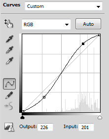
Curves Panel in Photoshop.
And that’s how we visually improved our game without spending too much time, and won some interesting tools in the process. I hope it was useful!
If you want to see more, check our youtube channel (Youtube.com), and if you have any doubts or want to discuss something about this article, don’t hesitate to contact me at (dani@lunaticpixels.com).
Website: www.alchemicjousts.com
Twitter: twitter.com/lunaticpixels
Facebook: facebook.com/lunaticpixels