All screenshots used in this text are of older versions of Agency. We are excited to announce that we will soon reveal the new version of Agency, which has received a major graphical overhaul.
Hi everyone,
My name is Max and I am responsible for human-computer interaction in the neo-noir set multiplayer interactive deck building game Agency. In short, I try to ensure that on-screen events are clear and visually appealing while also providing intuitive ways for the user to interact with the game. Our game has gone through several iterations with regards to user interface, and I thought it would be interesting to touch upon how the previous iterations have helped shape an idea of what is required of a somewhat complex card game interface (not that Agency is a difficult game to play, but the game places high demands on an informative and clear user experience).
What is a deck builder?
In short, a deck builder, or a deck building game, is any game where you can build a deck (go figure). Agency is a game where you construct your deck not prior to starting play, but rather while playing the game. There is a limited card-pool to obtain cards of different costs from using in-game mechanics. From a user interface perspective, this can be quite the nightmare - upwards of 20 cards available for purchase should be displayed on the screen at the same time, as well as relevant information regarding the cost of those cards.
Creating a fluid experience
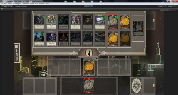
The above image displays the market, the place where you can obtain cards from while playing the game. We have since abandoned this graphical representation of the market (in place of a new, yet to be revealed one), but there were some upsides to our prior approach:
1) The core set of cards (the 5 rightmost cards, central to any game of Agency) is separated from the other 12 cards. When the card set can vary between games, this is important because is signalizes the fact that the core cards are static and do not change.
2) Players can still play cards from their hand (the bottommost area) while having the market open. This reduces annoying toggling of the market (done with the central button).
However, there were also some design flaws that we are keeping in mind for our new iteration:
1) The market covers the opponent half of the screen, which removes some feeling of the game being multiplayer in the first place (one of our overall design goals is to make the game feel interactive).
2) Cards take up an unnecessary amount of space for the information that they provide. Card names become so small that they are unreadable on most touch screen devices (tapping a card would enlarge it, but it would have been nice if this wasn't needed). Furthermore, the card descriptions are hardly readable, even on a larger computer monitor.
3) There is no room for expansion. While we had not considered it for our previous iteration of Agency, we still wish to open up for the possibility of potentially having more than 17 cards available per game.
Our new adaptation streamlines most of the problems mentioned above, and is in general an aesthetically more pleasing solution. More about that in a future update. For now - more problems of the past!
Target selection
Several of the cards in our game have mechanics where the player is required to select one or more targets for an effect to take place. However, trouble arises when the number of valid targets grow.
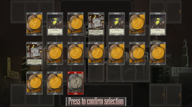
Because Agency is a deck building game with a limited card pool you are bound to have several copies of certain cards in your deck (as in the scenario above). When making a selection, the player might be interested in selecting only a certain type of card, but displaying the valid targets in the above fashion makes the task of selecting that certain type of card more difficult than it has to be. This is because there are several copies of the same card displayed on screen, and they are not grouped together but rather spaced out. When making limited selections, e.g. selecting a card from your hand, this form of layout felt natural. We have yet to reveal our new selection system, as it admittedly is not quite as polished as I feel it needs to be, but it does address the issues of the old selection system.
What comes next?

While I have mentioned some of the pitfalls of our previous user interface, there are countless more that we aim to fix in our new implementation. Along with improvements over the old, the new version of Agency will ship with additional, smart features for smoother gameplay, e.g. far more double-click shortcuts. Additionally, we have given the game a major face-lift, doing some drastic changes to how the game is represented on-screen, resulting in something more representative of how we envision Agency as a whole. In part 2 of this feature, which you can expect in the coming weeks, we will unveil our new game interface.
Feel free to follow us on facebook, youtube and here on indiedb for more updates on the game and its development.
Stay tuned,
//Max


Interesting read, keep it up!