Hi guys,
In this article, I'd like to talk about the challenges of Computer Tycoon's GUI. Computer Tycoon is the first game about Computer Evolution. It is a strategy and management game hybrid in which you see a lot of data. Showing a lot on different sized screens while having a unique style wasn't easy to plan out.
I didn't want to create a traditional GUI with rectangular screens. The Computer Designs of 70's were really interesting. Some like them, some don't, but they are definitely special and have a strong character. Computer Tycoon starts in this era, so I wanted to follow the shape culture of that era.
Designers always tried to create something fresh and give a feeling of futurism for their creations. This ended up having those rounded screen designs. The angles, the shapes are really strange for our eyes nowadays, but those times those were the future. Just think about sci-fi movies from the 70s and you will know what I'm talking about.
Having a well memorable GUI design is really important. Being influential and having something special is always recommended for indie games, so I took the risk of people don't like the old-school forms, the unnatural and for some outdated solutions. I think the benefits outweigh the disadvantages.
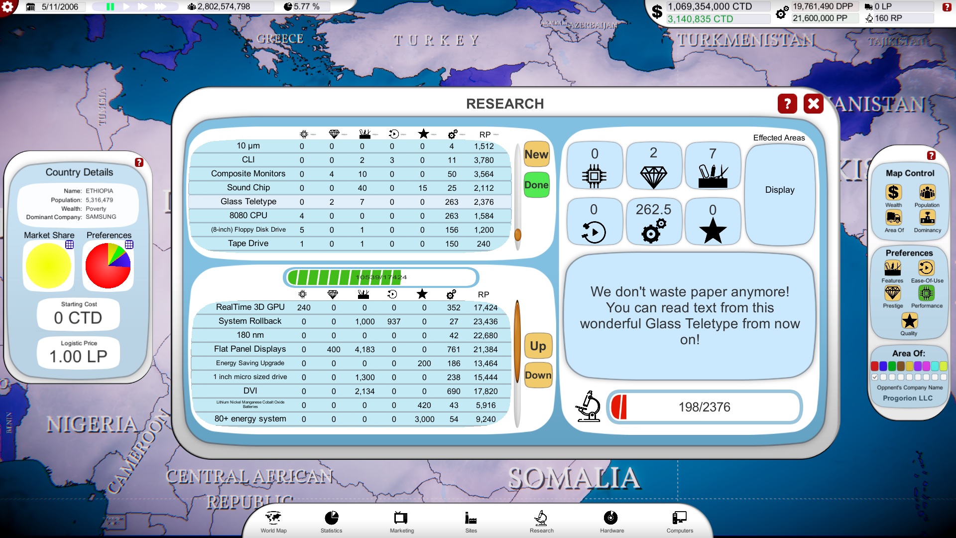
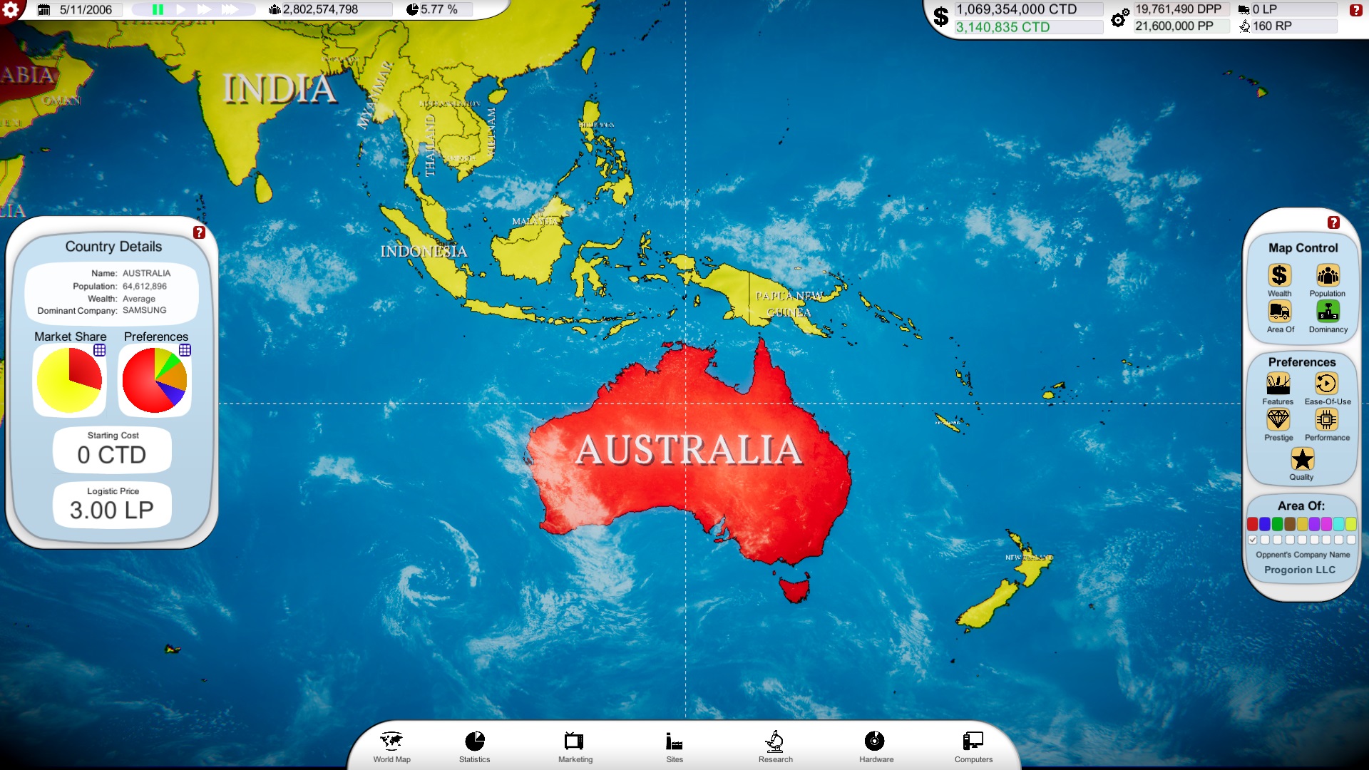
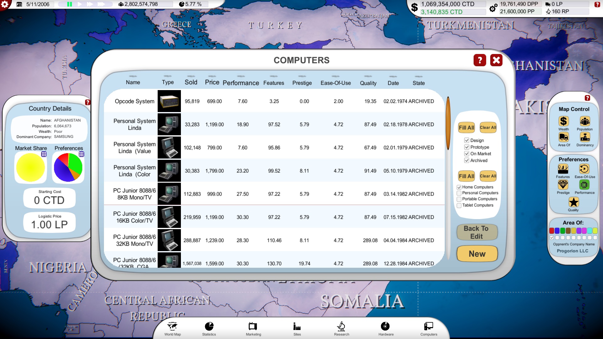
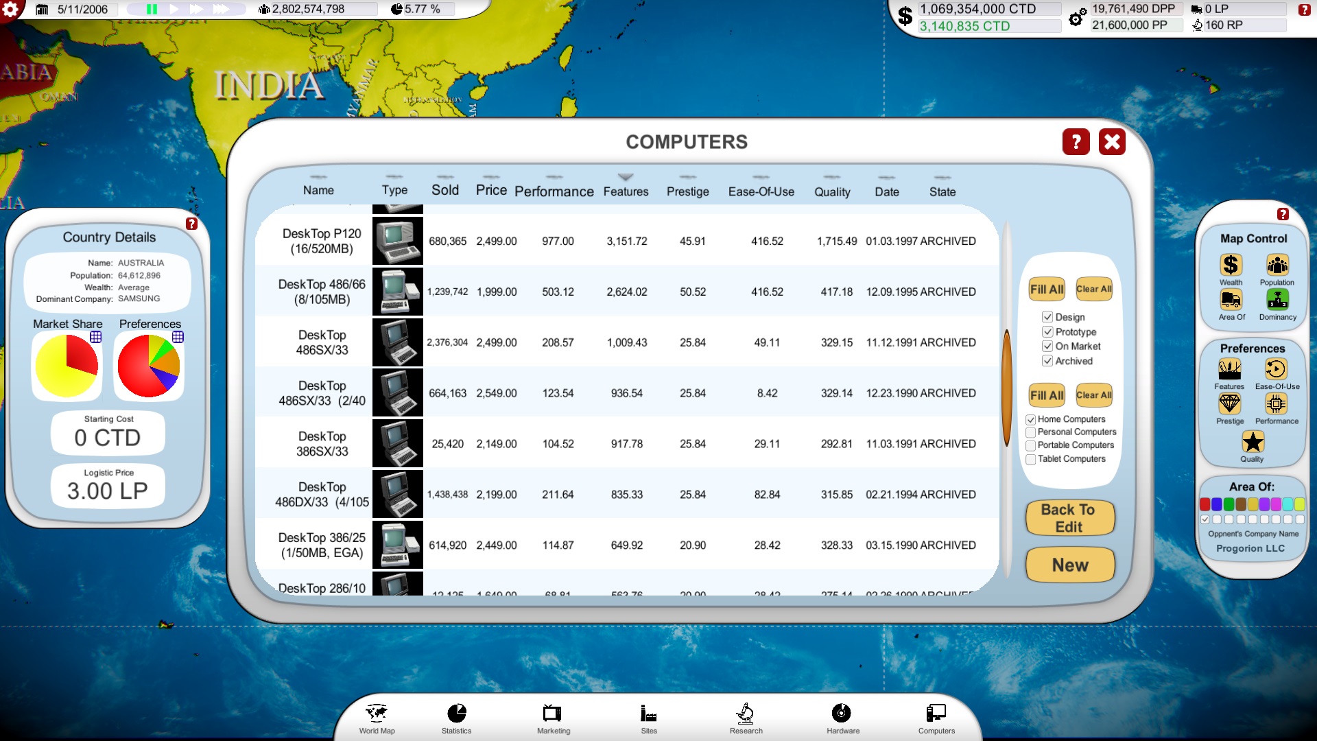
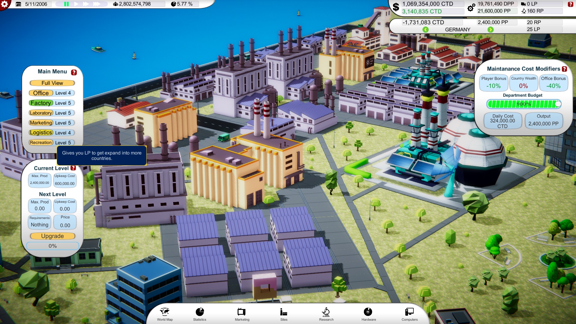
Another problem that this game has to show a lot of data. I mean a lot. This is a tendency for Grand Strategy games and Management games as well, so Computer Tycoon can't be an exception. Some of these games show even more data... such as this. Simply we have a lot of important data that the user must see. It is already challenging, but showing them in rounded windows is even harder. The rounded edges can reduce the useable are tremendous.
And this and my unfortunate weakness in general GUI planning made itself at the start of Computer Tycoon. Another problem was the close deadline that I had. I had to release the game close to the anniversary of Steve Jobs' memorial day. This forced me to release the game a bit earlier as I should have done. People had windows not working, having layer issues that banned the user to close some windows in some scenarios, and having some buttons that were not enough straightforward, having menu systems that were tedious.
Lesson learned. I will never ever rush the release date. Especially not because of a marketing event that I didn't execute myself but a bad small publisher team that fucks it up completely... but this is another story.
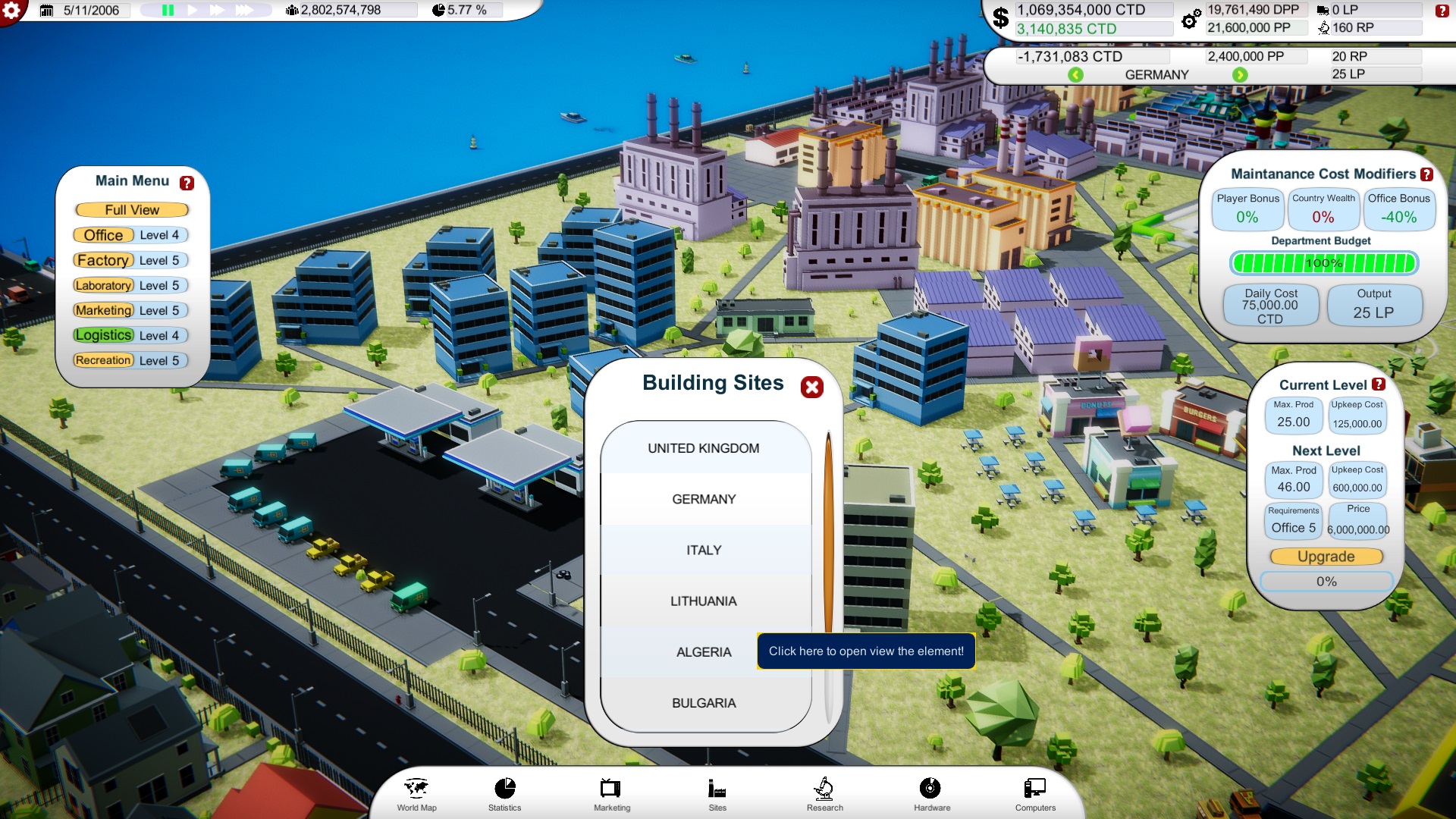
The GUI functionality problems are gone of course, for a long time. Also, the menu system is much better right now, but I release today a small style update. So check out the before and after pictures of the GUI. Still, there is a LOT to do, but the game will have so many modifications yet, with new screens and themes, that I don't wanna get deep into it, yet. It is going to be a long ongoing process! I've reduced the angle of the list roundings, so I have more space., Also I gave a bit of shading, stroke, inner shadow/light AND I reorganized the upper information bar.
There were just too much information at the upper section in a single line. People can't handle it...
I hope you like what you see! Remember checking out the game's roadmap here:
Steamcommunity.com
I'm currently working on the tech/research updates of the game. You will get a tech tree and and some more!
Also please check out my friends site:
Razorsedgegames.org
He gives an awesome support and promotion for indie games for free on his site. He has a really nice community, so you could get eyeballs on your game if you share it with him!
And here are the before pictures:


And here are the new Screens! The small changes can make the difference, right?